
Stop redesigning logos nobody asked you to fix.
A prettier logo isn’t always a better answer. A conversation with Tom Muller about context, creative ego, and the work we should be sharing instead.

Congratulations. You’ve redesigned the Nike logo.
Nobody asked you to. Nike certainly didn’t. But you’ve rounded a few corners, added a gradient, and presented the result as though you’ve just rescued a struggling business from a terrible mistake.
The comments are fighting. The views are climbing. Somewhere, a brand strategist has quietly closed their laptop.
I’m exaggerating. Slightly.
During my conversation with designer and creative director Tom Muller, I brought up something I’d posted online: maybe this would be the year designers stopped “fixing” logos nobody asked them to fix.
Tom understood the appeal. These videos are entertaining, recognizable, and very good at getting attention. But he also put his finger on what bothers me about them: the assumption that someone else’s work was broken in the first place.
The word “fix” is doing a lot of work
There’s a difference between exploring an alternative and announcing a correction.
“Here’s another direction I wanted to try” invites a conversation. “I fixed their logo” announces that the conversation is already over. The original designer got it wrong. You got it right. Please like and subscribe.
That’s a pretty confident conclusion to reach without having seen the brief.
You probably weren’t in the client meetings. You don’t know what had to remain recognizable, which audiences the identity needed to serve, or what the company was actually trying to change. You’re looking at the answer without seeing the question.
And yes, sometimes the answer really is bad. Design criticism matters. Nobody needs to pretend every corporate rebrand is a masterpiece.
But “I prefer this” and “this solves the problem better” are two different claims. One is a taste judgment. The other needs a little more evidence than a satisfying before-and-after animation.
If you don’t know what the design needed to do, how do you know you’ve improved it?
The part you can’t see in a logo
Tom’s work on Marvel’s X-Men identity is a useful reminder that even a very ambitious redesign comes with context.
He told me that Marvel gave him surprisingly little pushback. One important requirement, though, was that the X needed to sit inside a circle. That relationship was already iconic to the brand, and the team wanted to preserve it.
That detail could look like a limitation from the outside. Inside the project, it was part of the job: make something new while carrying something meaningful forward.
Imagine removing that familiar element because your version looks cleaner. On a blank background, maybe it does. But “cleaner” doesn’t automatically mean more useful, more recognizable, or more appropriate for the people who actually need to use it.
The brief is often full of things that never make it into the Instagram carousel.
- 01Who it’s for
- 02What it needs to do
- 03What must stay familiar
- 04Where it has to work
- 05What success looks like
That’s why I’m much more interested in hearing how a designer arrived at a decision than being told the decision is objectively better.
What did you try? What didn’t work? Which requirement forced you to think differently? What did you keep, and why?
Those are the parts that teach us something.
Show me the work that’s yours
One of Tom’s most interesting observations was that he’ll sometimes look beyond a redesign video and discover that the designer’s own work is more compelling than the thing they’re trying to fix.
That feels like a missed opportunity.
You’ve developed a way of thinking. You have a style, a process, a set of interests. And the introduction you’re giving people is an argument about somebody else’s logo.
“I love hearing designers talk about how they created a piece of work”
Tom went on to talk about the thinking and the guardrails behind a project—the things a designer couldn’t do, and the decisions that came out of those restrictions.
I’d happily watch that. Show me the sketches that went nowhere. Show me the moment a client question changed the direction. Show me a problem I wouldn’t have thought to ask about.
A familiar logo gives people an immediate reason to click. Your own thinking gives them a reason to remember you.
Criticism still belongs in the conversation
Here’s where I have to point the finger back at myself.
During the same episode, I told Tom about sharing the Cosmic Sans wordmark. I loved the direction. On Instagram, the reaction was encouraging. Then I posted it on Reddit.
Reddit, as you might imagine, had some thoughts.
Much of the feedback centered on legibility. People weren’t necessarily reading the name the way I was. And once I stepped back from the design I’d been staring at for so long, I could see what they meant.
That was useful criticism. It identified a problem that mattered: could someone actually read the name of the podcast?
Tom shared a similar experience with lettering he’d worked on for Spring Breakers. The producers thought it reminded them of a sushi restaurant. That wasn’t what he’d intended, but it revealed an association he hadn’t seen from inside the work.
Neither story means the designer should surrender to every opinion. It means fresh eyes can catch something familiarity has hidden.
Being open to criticism and being skeptical of “I fixed it” content can coexist.
The difference is whether the conversation helps us understand the problem—or simply gives someone a stage to announce their superiority.
Keep the experiment. Lose the rescue mission.
I’m not asking anyone to stop practicing.
An unsolicited redesign can be a great exercise. It can give you a brief when you don’t have a client, push you into a new discipline, or help you explore a direction you wouldn’t get to try at work.
Tom wasn’t dismissing every speculative project either. He recalled an unsolicited redesign he’d genuinely admired. The issue was the posture around the work: the suggestion that you’re showing everyone else how it should have been done.
So keep the experiment. Just be honest about what it is.
- Explain the problem you chose to explore.
- State the assumptions you’re making about the audience and the brief.
- Show what you preserved, what you changed, and why.
- Talk about the tradeoffs, including what your version might lose.
- Label it as an independent concept, rather than a commissioned solution.
That turns a verdict into a piece of thinking other designers can learn from.
And if the only explanation is “I thought this looked cooler,” that’s okay too. You’re allowed to make something because you wanted to see it. It just doesn’t need a rescue narrative attached.
Give us something better to watch
I joked with Tom that I should make a post called “Here’s how I’d redesign the Apple logo,” followed by a second slide that simply says: “I wouldn’t.”
Tempting. Very tempting.
But the more useful version of that frustration is a request: show us more of the work that could only have come from you.
Share a strange experiment. Explain a difficult decision. Talk about the feedback you resisted and eventually understood. Let us see what happens between the blank page and the polished case study.
You don’t have to rescue a famous brand to prove you’re a good designer.
Give us a reason to care about your thinking. That’s a much better introduction.
From the page to the podcast
Keep the conversation going
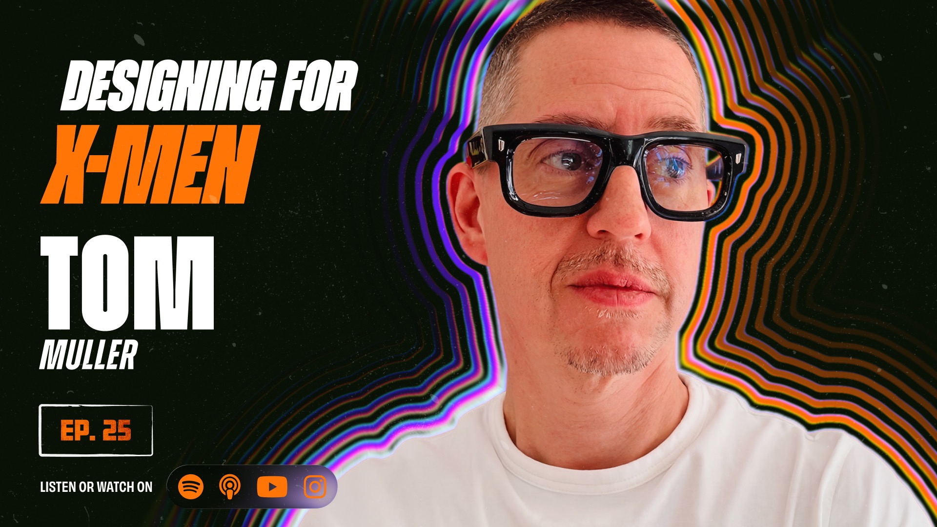
This article grew out of my conversation with Tom Muller, the designer and creative director behind helloMuller. We talked about designing for X-Men, building an independent studio, creative direction, feedback, and the work behind the work.
The discussion about unsolicited logo redesigns starts around 1:07:44. Watch the full episode for the stories and context behind Tom’s perspective.
Tom Muller · 1:37:00